The Problem
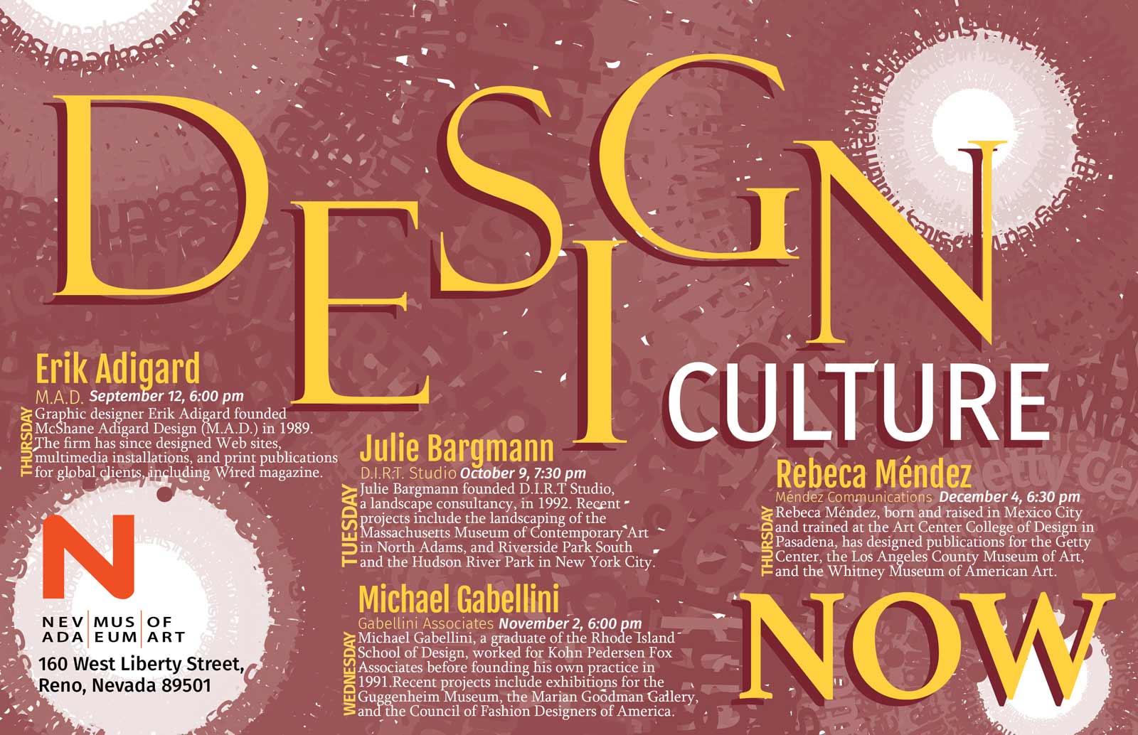
This project called for designing and producing a poster for a lecture series about contemporary design being held at the Nevada Museum of Art while carefully considering typographic hierarchy of the information being presented. The poster must convey the information easily and the excitement of today’s design to an audience of designers and design students. The poster must focus on typography for all aspects, this includes any and all imagery created, and the type must remain live. Two spot colors plus black were allowed for color.
The Solution
After some thorough research and many design variation ideas, this is my final poster design for the lecture series. I designed it so that it is eye-catching and solely with the required text. All type is live and made sure that the background was covered enough so that the speakers’ information could still be legible. I made the word “DESIGN” have this alternating look in order to create some movement to catch the eye and have placed the museum’s logo within the lighter spot of the radial background. To make things pop off even more I put a drop show on the three main words of “DESIGN”, “CULTURE”, and “NOW”.

