Grid Icon

Everyday Beautiful
Logo & Website

The Problem

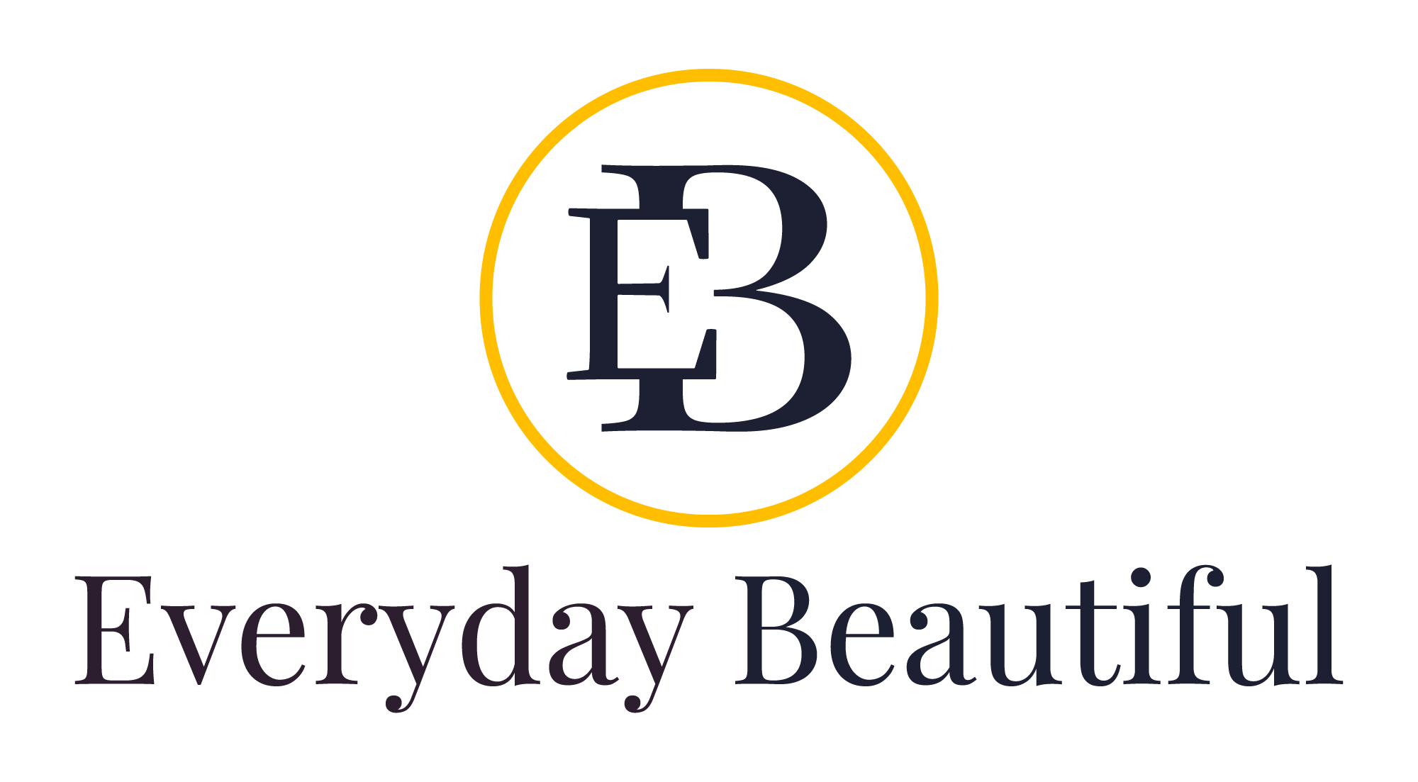
Everyday Beautiful is a business that sells beautiful wigs and wanted to rebrand themselves so that they are seen as more high-end, elegant, and expensive. The owner wanted the logo to be simple, elegant, and bold that stayed away from icons of hair or faces and use colors that give the feeling of being high-end, expensive, and bold.

The Solution

In order to stay away from image icons, we chose a letter mark as her logo icon with the chosen colors of black and gold. The serif type gives it that boldness and high-end/expensive feel with the gold circle making it elegant.
The Problem

This website is a redesign and part of the rebranding process after designing her new logo with bold and elegant colors. Her site not only needed to show the beauty of her wigs but all of her other services and what people had to say about them. Directions to her physical store location was also needed within the contact area.

The Solution

For this website, black and white are used as the primary colors with the gold being a beautiful accent, continuing to give the overall feel of high-class, elegant, and boldness to the site. I used the same serif font from her logo for all headers and a well-paired sans-serif for the body copy. Images of her wigs are the primary focus on the homepage, including a store piece, along with some stock images of women with beautifully think and rich hair. Directions to the store can be found in the contact footer area at the bottom of the page with the rest of her contact information. Her selections of inventory and full service wig care can be found just under the store piece as well as in the navigation by clicking on shop and services.