Grid Icon

The Language
Emporium Logo
& Brand Strategy

The Problem

This client was a brand-new company about learning languages who needed a brand-new logo and branding all together. She wanted a logo that would make her customers feel welcomed and warm when visiting her site online, which is where the majority of the business would be. She knew that she wanted an Arabic L incorporated into the design as well as being something that would appeal both to children and adults.

The Solution

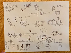
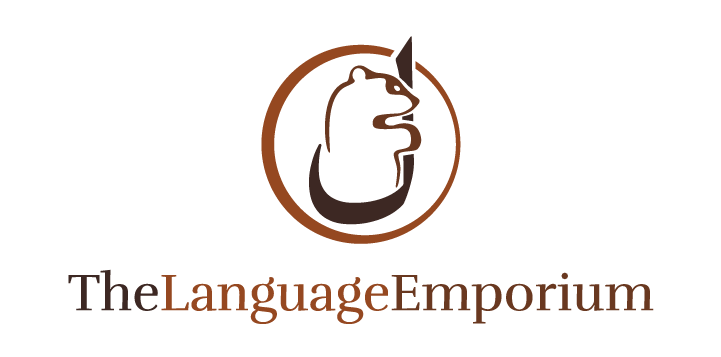
Coming to the right solution was a journey for this client, but we eventually did reach our goal of creating a logo that suited her and her business. I came up with the icon being of a bear hugging an Arabic L that is encompassed within this circle, representing the world of languages that she plans to teach to her diverse customers. The bear is a warm and welcoming figure with the type being a fun display font.

The Final Branding

Preliminary Branding

The Problem

This client is a brand-new business that had only an idea for what she wanted to sell, but wasn’t sure how she wanted her company to feel and look to others who would be coming to her for her services. Therefore, she needed a logo, branding colors, a website, and to determine exactly what she wanted her company to look and feel like to her customers.

The Solution

After a couple of branding exercises, we came up with a color palette of dark and rich browns with an orange accent color, as well as this logo of the bear hugging the Arabic L that breaks through this circle, representing the world of diverse people she hopes to help with learning different languages. This single stylescape shows her fonts, colors, and imagery that can all be used and are now incorporated into her branding for her website, logo, and even any stationary pieces.