The Problem
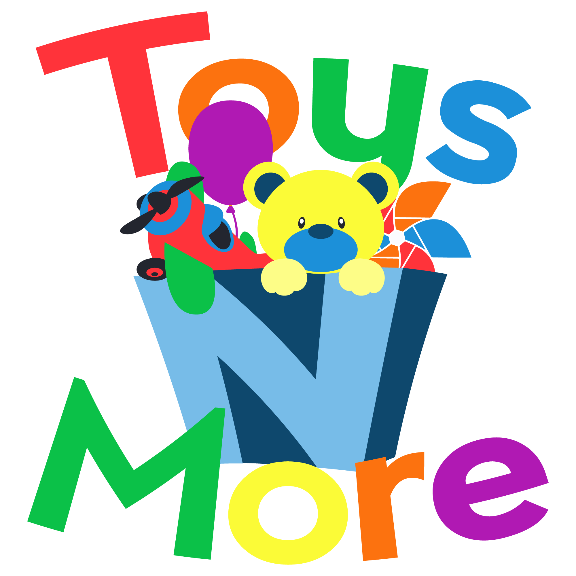
This small business needed a logo for their new toy store. They wanted it to be fun, and vibrant and colorful, and for kids aged about 5-12yrs old. They already knew they wanted a big toy box with toys exploding out of it with the type being rounded and fun but not balloon-like.
The Solution
I took this idea of a toy box and put the N on it so that it could be in the center of the logo. Three of the most common toys were chosen to be coming out of this exploding toybox plus the balloon to continue showing that they are all about having fun. The final logo ended up using five different colors with shades that are complementary of one another so that they would look great together or separate. The chosen typeface was a sans-serif font.


